
GreenBay Perfect Property
Objectes:
GreenBay is an app made for real estate investors to help them find the perfect property, even if they were searching on the go.
Overview:
I worked on the responsive design of GreenBay mainly as a UI designer in the context of the UI for UX designer course under CareerFoundary. I worked under the supervision of my mentor then. The research and persona for this app was given, and you can easily find them here.
As I worked on this project I learned the following skills:
-
Customizing user flows.
-
Creating low/mid - fidelity wireframes & pixel perfect high fidelity wireframes.
-
Prototyping and rapid prototyping.
-
Responsive design & applying the suitable grid.
-
Applyling UI elements & organizing them.
-
UI design patterns.
-
Visual design principles and trends.
-
Creating moodboards.
-
Typography, color & creating color palettes.
-
Applying & editing imagery.
-
Creating and applying shapes and icons.
-
Creating and customizing basic animations.
-
Interaction design & specifying the gestures.
-
Creating style guides.
-
Designing for different breakpoints.
-
Creating final mockups.
-
Organizing deliverables, design handoff & presentation.
and the tools I used in this project are:
-
Samsung Notes on a tablet and pen for sketching.
-
Sticky notes and marker.
-
Marvel for rapid prototyping


Content
01
User flows
In case of this project an intial user flow was given. But I worked on simplifying this user flows, so that I'd decrease the number of screens, and save the user time going through many pages to finish his tasks. One of the exampIes of this simplifications examples that the search filter screen and the property preference setup screen will have the same content, but with different title. I used Lucidchart, which is really easy to use.
The main user flows I was working on were as following:
-
Signing in/ signing up.
-
Search properties & filter results.
-
Customize user account and property preferences.


02
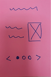
Low fidelity wireframes
After finishing the user flows, started to sketch the low fidelity wireframes for the flows mentioned above using sticky notes and a marker. They were as following:
Onboarding

Search results

Contact property seller

Sign up

Search filter

Bookmarking confirmation

Sign in

Search filter scroll down

User account

Homepage

Property listing

Property preference setup
Then I took the sketched low fidelity wireframes to the next level of iteration; I put them in a digital form in the form of low fidelity wireframes on Samsung notes using a tablet with pen & pdf templates. Here I also added the text content.

Onboarding

Search filter

Bookmarking confirmation

Sign up
Property listing

User account

Homepage

Property listing
Scroll down

User account
scroll down

Search results

Contact property seller

Property preference setup
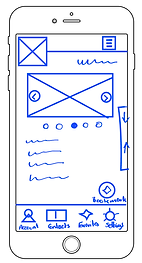
03
Applying the grid & creating the mid fidelity wireframes.
Here, I started to use Figma to create the mid fidelity wireframes, where I was able to apply some UI elements. Also applied the grid in the values:
-
4 columns
-
32px *2 Margins
-
20px *3 Gutters


Check more details about the mid fidelity wireframes, and who the elements were organized on Figma here
04
Visual hierarchy & spacing
In the process of continuous iteration the next step I took was checking the spacing of the entire elements on each screen. This allowed me to create a consistent pattern through all the wireframes. Also, through spacing & highlighting some elements I was able to maintain the hierarchy of the elements on each screen.
Here, I used some very helpful plugins on Figma like: Spacers and Redlines.
When I used Spacers, I repeatedly used the 16px blocks, and the most common spacing through the wireframes became (16px*2).

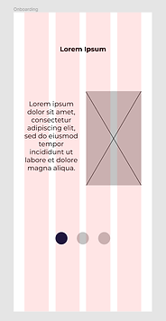
05
Adding UI design patterns
I then decided to apply two specific UI design patterns:
-
Visually guided sign in & sign up process.
-
"Sort by" option for the search results.
-
Maps for the property listing.
As following:
Visually guided sign in & sign up process


"Sort by" option for the search results.


06
Adjusting & unifying the typography
I started then to decide which fonts I'm going to use in the app. So I started to do my research; I read some guides on websites like typ.io, and tried some of the combinations. Then came with the final decision to use these fonts:
-
Open sans for titles
-
Montserrat for body text, primary action and forms
-
Lato for secondary actions, links and icon description

07
Customizing & selecting the color palettes
The next step after choosing the fonts for the app, I started to create color palettes to choose the most suitable one. I've to say that this was a challenging process for me as a beginner, and I've to add that at this moment I didn't know about the tools and websites like the color wheel on Canva, Color-Hex or Dopely colors. These kinds of tools could be really helpful, but I depended solely on my senses.
The main criteria in choosing the colors were keywords taken from the user research. These words are:
-
Security
-
User-friendly
-
Reliable and uncomplicated information


Above are the three palettes that I created, and I chose palette no 1 as the colors were more dynamic and energetic.
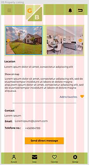
08
Imagery, shapes & icons
After choosing the color palette, I worked on the selection of the imagery for the app. It was important to be selective, and to create some rules that regulate the imagery content of the app. Although I knew that this kind of content will be in control of the users, as they will upload their images for the properties they are selling. But it was certainly necessary to have a standard at this point.
I used Figma plugins like Unsplash to apply the images on the wireframes.

Then I started to make my first experience in creating icons on Figma. I've to admit that this is one of the very challenging tasks of a UI designer, when he has to create a complete icon library for example. I succeeded in creating some icons, but I didn't apply them to the wireframes. Instead I downloaded some libraries from websites like Iconfinder & Flaticon to apply on the wireframes.

09
Interactions & gestures
In choosing the kind of interaction the user will use in GreenBay, with the different features & screens, I decided to make it as simple and standard as possible. So the main interactions in GreenBay are:
-
Tapping
-
Vertical scrolling
-
Horizontal scrolling
I added some gestures while presenting the interaction design of GreenBay.

10
Logo & style guide
I then worked on creating a logo for GreenBay on Figma. It was really important for me that the logo will reflect the style of GreenBay, so that the brand will act like an introduction to the GreenBay style and colors.
Also, I created a style guide on Figma that included all the UI elements stated in the sections above.
11
Designing for different breakpoints
At this point I was only designing for mobile as a part of the mobile first design approch. Then I started to customize the grid for the other breakpoints:
Tablet:
-
On a tablet screen width= 834 px
-
2*Margins= 2*32 px
-
8*Columns= 8*79 px
-
7*Gutter= 7*20 px
Desktop:
-
On a screen width= 1440 px
-
2*Margins= 2*40 px
-
12*Columns= 12*102 px
-
11*Gutters= 11*20 px
Then started to sketch on sticky notes the low fidelity wireframes for both:
Tablet

Homepage

Search results

Filter results

Sort results

Property listing
Desktop

Homepage

Search results

Filter results

Sort results

Property listing
I then started to work on these wireframes on Figma, while applying the values of the grids shown above. Also started to apply the UI elements used in the mobile design, and in a short iteration process created high fidelity wireframes:
Tablet

Homepage

Search results

Sort results

Filter results
Property listing
Desktop

Homepage

Search results

Filter results

Sort results

Property listing
12
Final mockups & handoff preparation
I've learned through the course and working on projects like GreenBay that being organized and consistent is a big part of my job. In the background, as the elements of UI increase in number, the more is the need for an organized structure for the whole design. As GreenBay was my last project in the course I was really focusing on organizing all the elements, that is why when I started to work on the handoff of the deliverables like icons and images I didn't need to spend much effort.
Then I started to prepare the final mockups of the app, so that I'll be able to present the work. I used plugins like Angle mockups on Figma to create the following mockups :


Conclusion
While practicing on GreenBay, I learned in more details about UI design, and gained the experience in working with different elements and tools, such as:
-
To customize grids for different breakpoints.
-
To apply consistent spacing & typography, to achieve visual hierarchy.
-
To create color palettes, and select the most suitable for the user's needs.
-
To apply the most suitable images, shapes & icons.
-
To create icons, if necessary.
-
To structure the interaction of the user with the different features of the app, and present them with the suitable gestures.
-
To create a style guide for an app.
-
To organize all the elements & prepare for the deliverables handoff
-
and finally to present the work done by creating mockups.
I'm looking forward to completing my work on GreenBay, as I'd like to see it in the app stores one day. And for completing the work it will be necessary to:
-
Conducting usability tests.
-
Iteration according to the findings of the tests.
-
Creating an MVP.
-
Repeating the cycle of the final iterations through usability tests.
Thanks a lot for your interest, and I'm looking forward to your feedback.
